A system where what a patient logs each day reaches their nutritionist.
Nuvra connects everyday meal logging with professional follow-up: a mobile app for the patient, a web dashboard for the nutritionist, and the same information moving between them.
Visit Nuvra ↗
Nutrition doesn't happen in the appointment
Appointments happen every few weeks. Eating happens every day.
Nuvra started from two things that currently run separately: daily meal logging, and the follow-up a nutritionist does across spaced-out appointments.
The patient produces information daily. The professional works in occasional sessions. Between one appointment and the next, that information stays on the patient's phone, or depends on what they can reconstruct from memory when they come back.
The opportunity wasn't another calorie app. It was connecting the two timeframes, so what someone logs day to day arrives as usable information for the person supporting them.
In between are the meals, the decisions and the doubts of every day: the material the next appointment works with.
Two applications, one system
Nuvra isn't an app with an admin panel bolted on. It's two separate experiences, built for two distinct jobs, over the same information.
Defining that relationship was the first architectural decision: what each side produces, what the other side needs to see, and when the information crosses over. The patient logs and reviews their day. The professional reads, interprets and responds. Neither one uses the other's tool.
- 01Patient
Logs a meal from their phone.
- 02System
The entry becomes part of the follow-up.
- 03Nutritionist
Sees that person's day in the dashboard.
- 04Nutritionist
Leaves a note on what was logged.
- 05System
The note stays attached to that meal.
- 06Patient
Reads it in their day, without leaving the app.
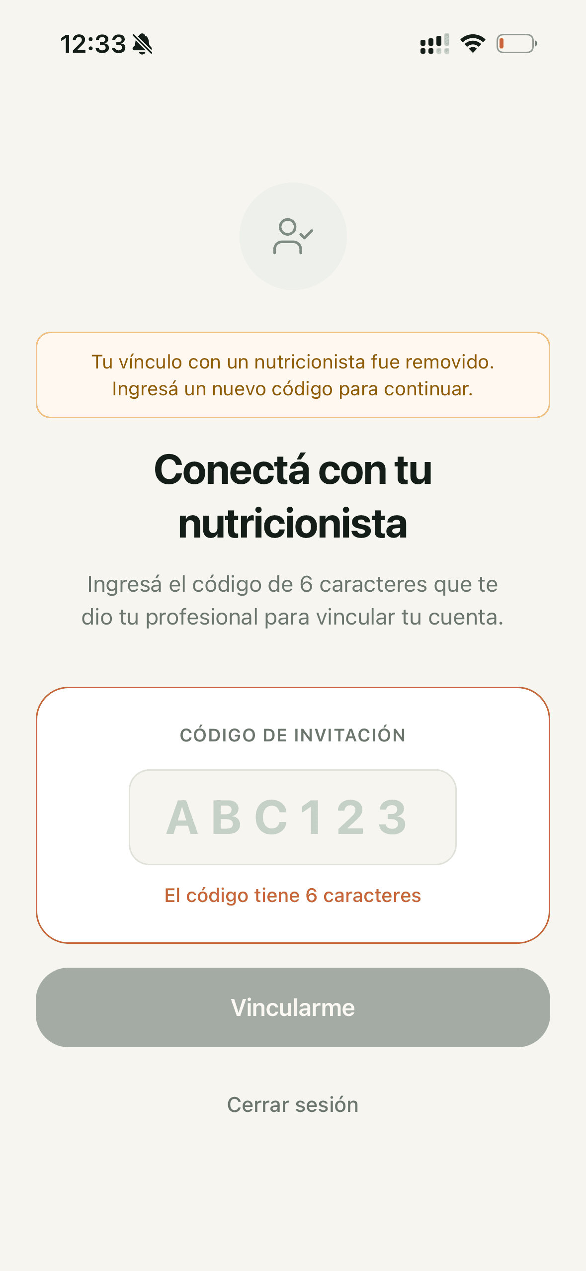
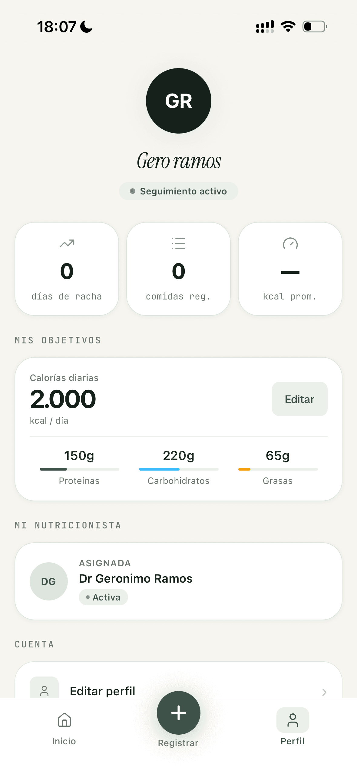
What matters is that the relationship between patient and professional exists explicitly inside the system: without that link there's nobody to show an entry to, and with it everything the patient logs has somewhere to go.
Logging a meal shouldn't feel like a chore
Manual entry is the most expensive part of any nutrition app: search for the food, pick the right variant, work out the portion, fill in the macros. Every day, several times a day.
I decided to solve that moment with a photo: AI estimates calories and macronutrients, and those values arrive pre-filled in the form.
AI here isn't a feature to show off: it lowers the cost of a task that has to be repeated daily, and that repetition is exactly what produces the information the follow-up runs on.
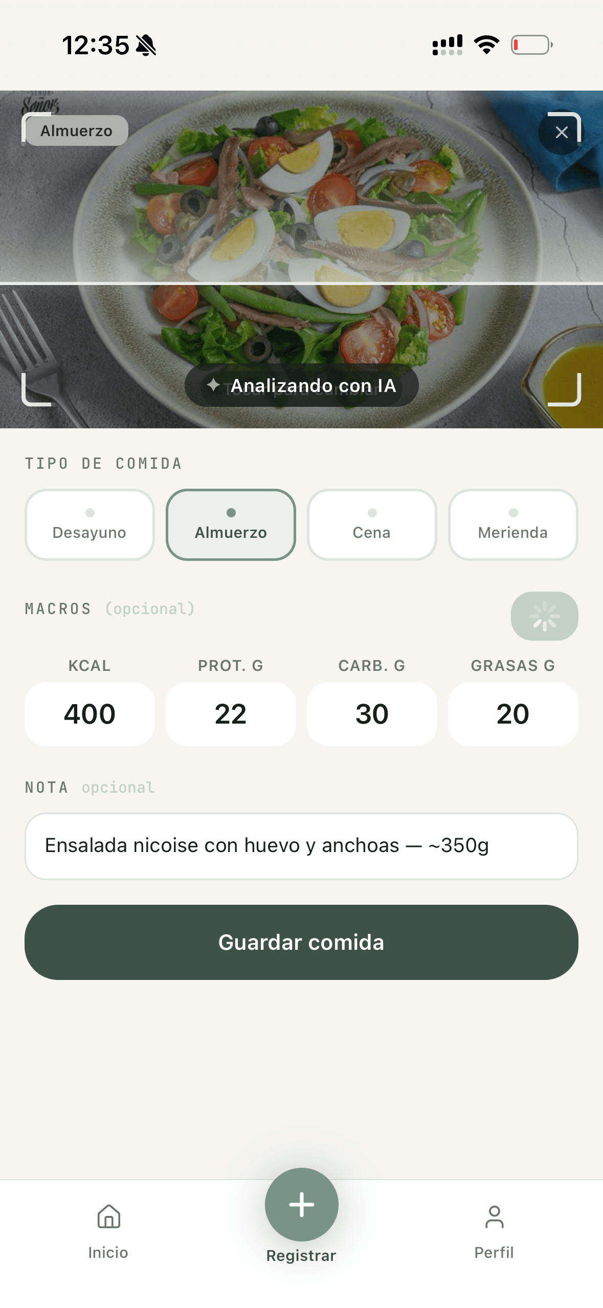
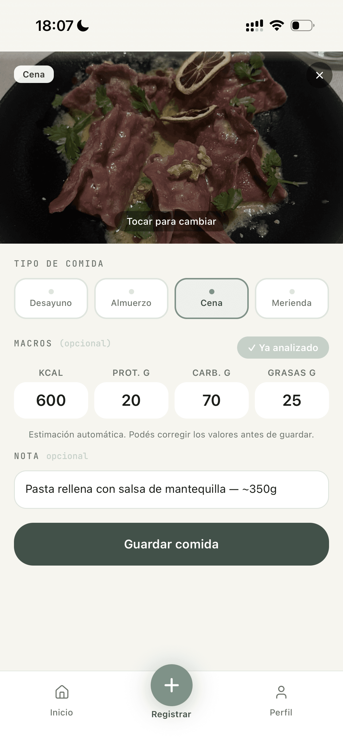
The estimate arrives editable. The entry still belongs to the user.
An estimate made from a photo can't be presented as an exact figure: if the system gets it wrong and the person can't step in, the entry stops being trustworthy for either of the two people who depend on it.
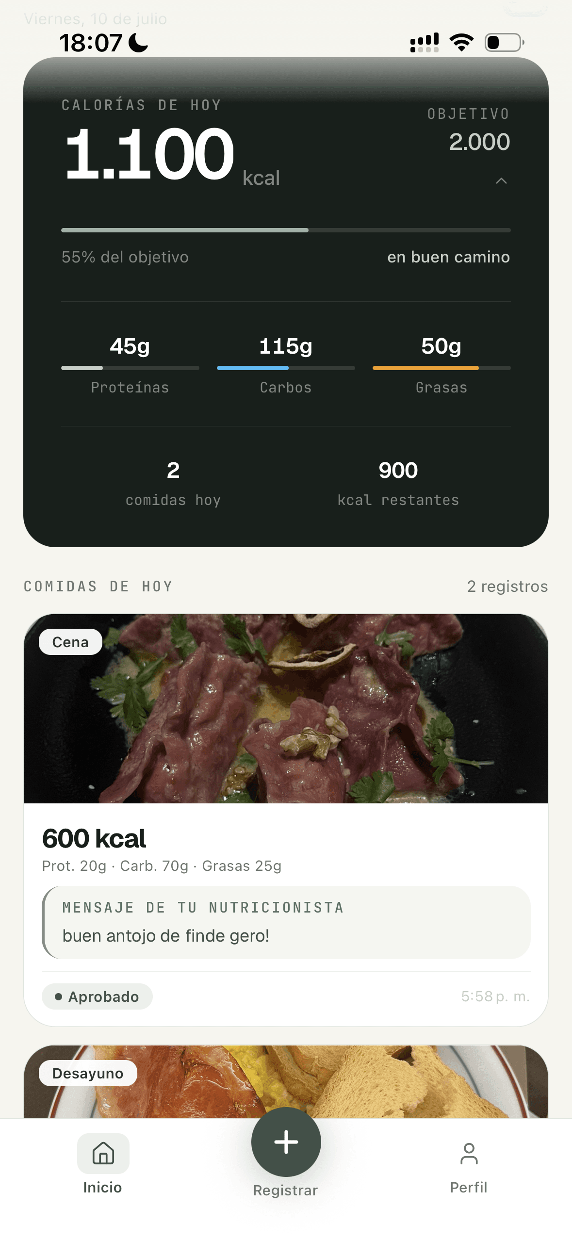
The information doesn't stop at the phone
On the nutritionist's side the problem stops being entry and becomes reading. Someone with several active patients doesn't need to see everything each of them logged.
So the dashboard works at two levels, and each one exists to answer a different question. They aren't two screens about the same size of problem.
Who needs my attention today?
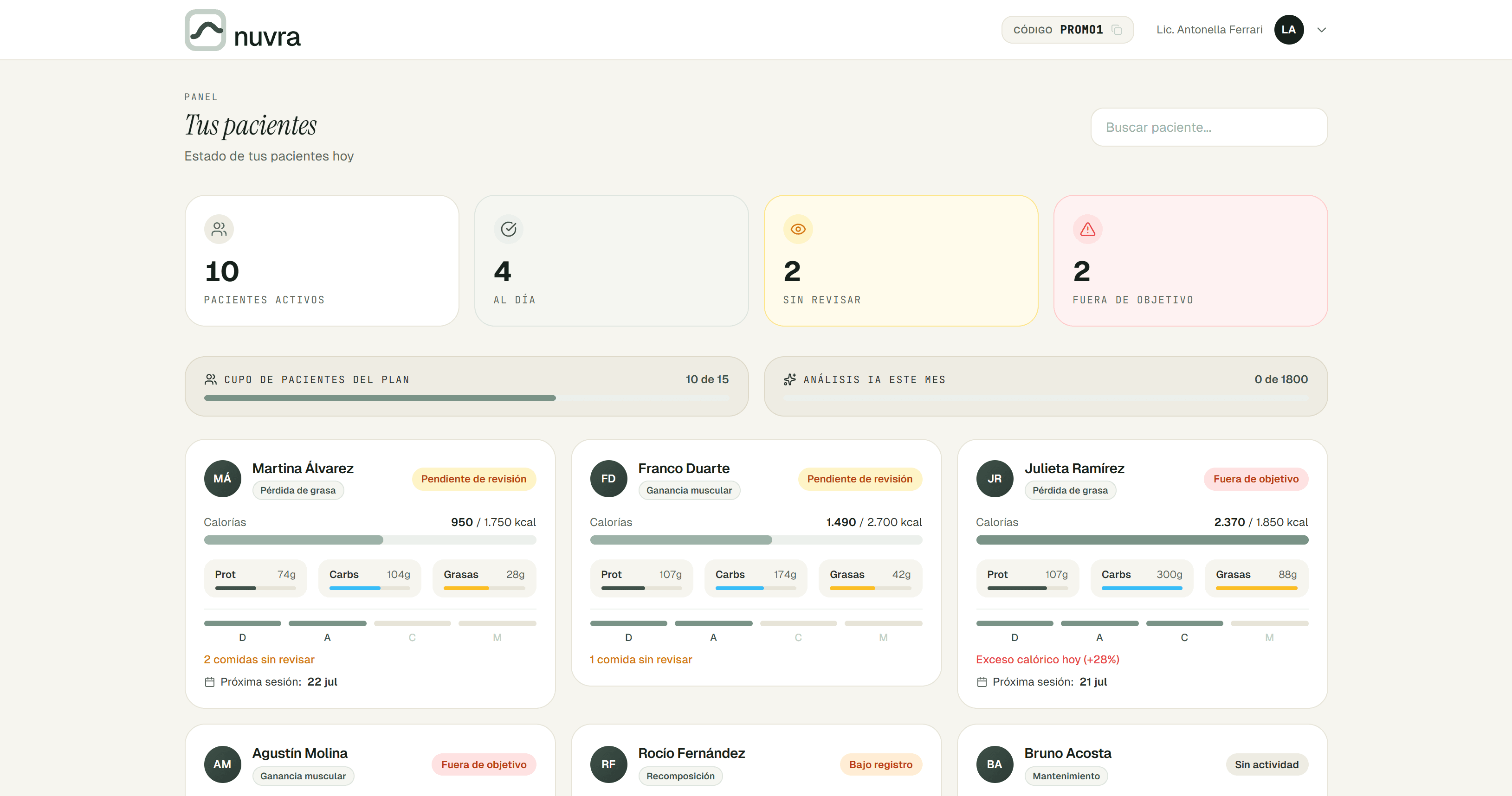
The overview doesn't show meals: it shows states. Pending review, off target, low logging or inactive sort the list before the professional opens anything. The information decision here was to show less per patient in order to show all of them at once.
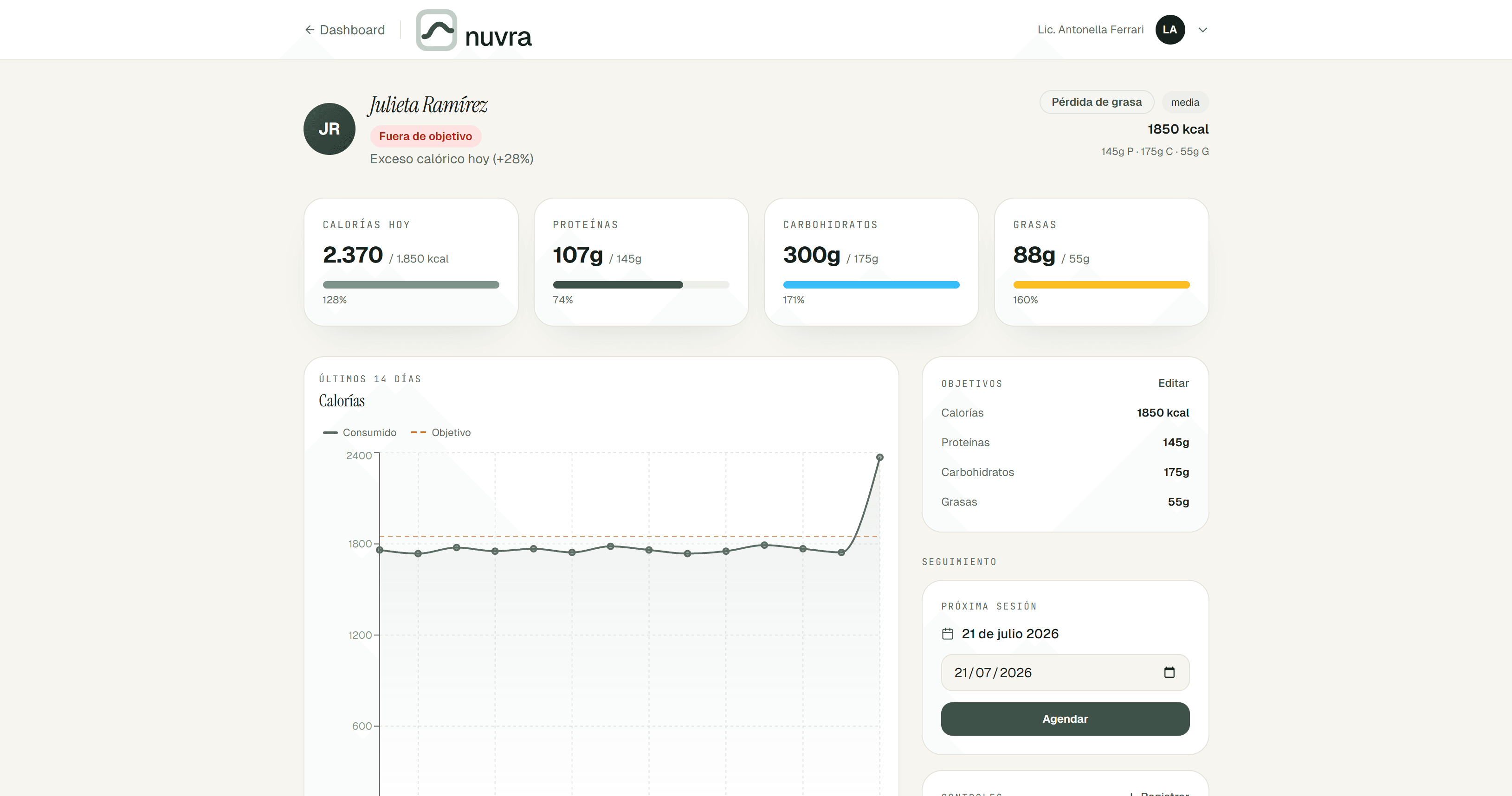
What's going on with this person?
The individual view does go into the day: calories and macros against the goal, how the last two weeks have gone, the goals on file and the next session. It's where the professional prepares to talk to someone.
Designing follow-up, not judgement
The first version handled the response with two actions: the nutritionist could approve or reject each logged meal. On paper it closed the loop: the professional reviews, the patient gets an answer.
Several nutritionists tried the MVP, and that was the point that drew the most comments. A binary verdict on what someone ate doesn't resemble how they work: an appointment doesn't approve or reject plates, it reviews a period and comes back with an observation. And on the patient's side, a rejection on your phone is hard to read as support.
So I changed the interaction. The dashboard is now built around reviewing: the states talk about meals not yet reviewed, and what reaches the patient is a note from their nutritionist inside the entry itself.
Approve / Reject
Review / Add note
It wasn't a copy change: it changed what's expected of the professional, and what the patient gets back for having logged it.
That's where the loop closes. What someone logged on a Tuesday comes back as a note from their nutritionist, without waiting for the next appointment.
The MVP is built and running.
Beyond defining the product and designing both experiences, I built Nuvra through to a functional MVP using AI-assisted development with Claude Code.
Working out the concept, defining the architecture between patient and professional, designing the interface and building it were all part of the same job. Every decision could be tested against a product that runs, not against a screen.
That's also what made iterating possible once the nutritionists came back with comments: the change could be made in the product, not in a design file.
- Linking to a nutritionist with an invite code
- Logging meals from a photo
- AI estimate of calories and macros, editable before saving
- Day, goals and logged meals
- Notes from the nutritionist on individual entries
- Dashboard covering every patient's state
- Review and goal states
- Individual patient detail
- Calories, macronutrients and trend
- Goals and next session
- Notes on logged meals
Tested by professionals, not yet by patients
Several nutritionists used the MVP and gave me feedback. That feedback is where the product's iterations actually came from, including the most important one: replacing approval with review.
It wasn't a research study or a test with end users, and I don't want to dress it up as one: it was professionals using a working product, telling me what didn't match the way they work.
Nuvra hasn't been tested with real patients yet. That's the part still missing, and it's the part that decides whether the system is worth anything.
What holds up so far
- The MVP works end to end, on mobile and on web.
- Real nutritionists used it and came back with comments.
- That feedback produced concrete changes in the product.
What still needs validating
- What happens when someone logs every day for weeks.
- Whether follow-up between appointments changes anything in a sustained professional relationship.
- Which part of the system creates enough value to support a business.
Designing a system means deciding what each side sees.
Nuvra forced me past the interface: two different users, two devices, and a single body of information that had to mean different things on each side.
The part that taught me most wasn't the AI or the dashboard, but having designed a reasonable interaction that was still wrong, and changing it because the people who were going to use it explained why.